
The landing page, also known as the landing page (landing page), plays an important role in online marketing campaigns. Its effectiveness is assessed not only by the number of visits, but above all by the conversion rate. Below are examples of landing pages that stand out in terms of effectiveness.
1. InPost
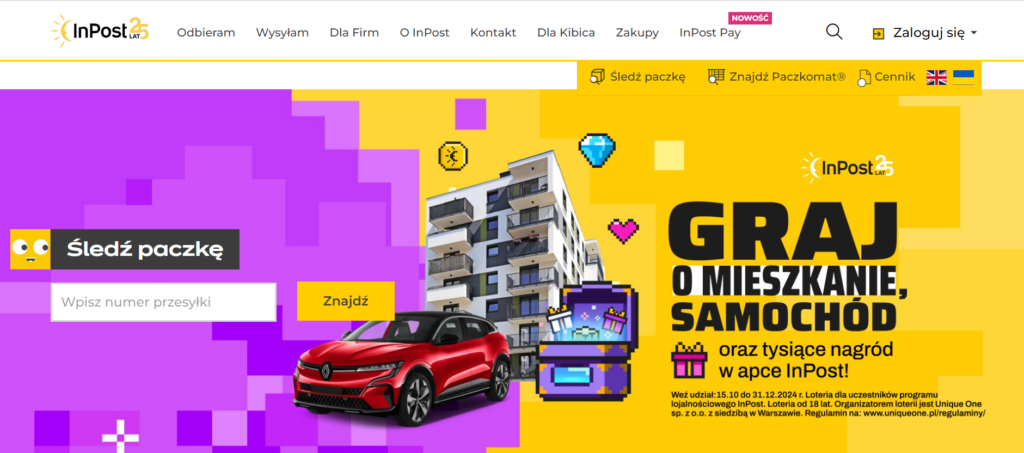
- Description: InPost, lider w branży logistyki paczkomatowej, stworzył stronę docelową, która skupia się na szybkim dostępie do usług. Na stronie znajdziemy proste i czytelne komunikaty oraz mocne CTA, takie jak „Śledź paczkę” czy „Znajdź paczkomat”. Strona podkreśla także korzyści płynące z korzystania z ich usług (np. udział w konkursie).
- Overview: InPost's website is an example of an effective landing page that focuses on the value the company delivers to customers. Key features such as fast parcel delivery and parcel machine availability are immediately visible and clear CTAs encourage action. The uncluttered nature of the site makes it easy for users to find what they need without an overabundance of irrelevant information. In addition, the attractive design encourages them to stay for longer.
2. Mubi
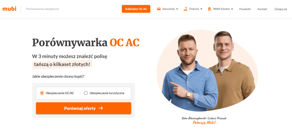
- Description: Mubi is an insurance comparison engine that offers a uniquely clear landing page. The main call to action 'Compare quotes' encourages users to use the calculator.
- Overview: Mubi effectively guides the user step-by-step through the premium calculation process. Large, clear CTAs and keeping the amount of information to a minimum make the landing page easy to use, and users can quickly make a decision to purchase insurance.
3. Evernote
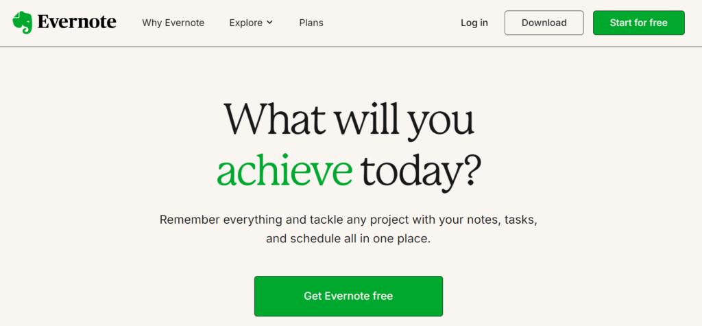
- Description: Evernote presents a simple but functional landing page that focuses on presenting the app's value. The slogan "Remember everything" emphasises the main purpose of the app, which is to organise and remember important notes. The main CTA "Get Evernote free" immediately grabs attention.
- Overview: The Evernote website focuses on clarity and functionality. The simplicity of design and clear CTAs make it easy for users to understand what the app is for.
4 Crazy Egg
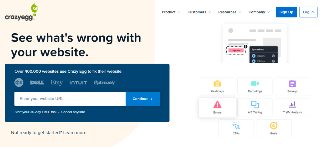
- Description: Crazy Egg, a tool for analysing user behaviour, presents its functions in an accessible way using simple icons with short, understandable descriptions. The main headline "See what's wrong with your website" immediately grabs attention, clearly communicating the purpose of the tool.
- Discussion: The Crazy Egg website is a great example of the combination of simplicity and efficiency. Concise sections and clear visuals ensure that users quickly understand how the tool works. Examples of sites that have used Crazy Egg further build confidence and emphasise its effectiveness. The main call to action, integrated with the visuals, perfectly encourages users to test the product, highlighting its value in real-world applications.
Key findings
Każdy z powyższych przykładów pokazuje, jak różne elementy mogą współgrać, aby stworzyć skuteczny landing page. Niezależnie od branży, kluczem do sukcesu jest:
- Simplicity
The minimalist design and clarity of the message means that the user does not feel overwhelmed and makes the decision easier.
- Clear CTA
A highly visible call to action, such as 'Sign in' or 'Download now', should be placed prominently.
- Clear message
The landing page must quickly and clearly show what the site has to offer.
- Functionality
With intuitive navigation and ease of use features, the site effectively converts users into customers. Why is this happening? When we come across a website that is difficult to use or unreadable, we feel frustrated and quickly lose interest, no matter how attractive it seemed at the beginning. Simplicity and user-friendliness are key to maintaining attention and building a positive experience.
Summary
An effective landing page consists of many elements that are mutually complementary. Kluczowym aspektem jest zrozumienie potrzeb i oczekiwań odbiorców. Pozwala to na dostarczenie wartościowych informacji w atrakcyjnej formie.
When these elements are harmoniously combined, The website effectively attracts and retains the attention of potential customers. When well designed, it not only informs, but also engages users, naturally leading them to perform the desired action.

 4 minutes reading


